GV’s two logos: The history of the design
Mar 20, 2023
Across Grand Valley State University’s campus, website and databases, there are two different logos that represent the university.
The “circle G” is the official logo for GVSU. While the design has been in use since the early 1970s, numerous changes have been made over the last 50 years to create the logo most commonly used today.
When the original “circle G” was created, GVSU was known as “Grand Valley State Colleges.” This name reflected the recent adoption of a cluster college organization, featuring four distinct colleges: the College of Arts and Science, Thomas Jefferson College, William James College and College IV, later called Kirkhof College.
During this time, the logo featured a leaf inside the “circle G” design, representing the university’s rural setting and rebirth during the decade. The single line design was meant to symbolize the one large school “encompassing a number of smaller colleges within.”
When the college changed its name to “Grand Valley State University” in 1987, the leaf was removed from the logo, however the “circle G” design remained.
In 2003, GVSU secured a licensing agreement, federally registering and protecting its right to the use of the design, along with the wording “Grand Valley State University” and mascot Louie the Laker.
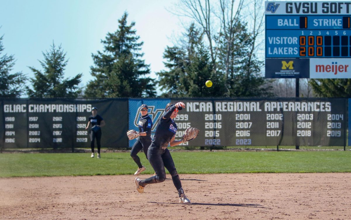
Another logo many students may be familiar with is the standard “GV” design; the athletics logo that was adopted in 2011.
During the early 2000s, GVSU’s athletic department was gaining more prominence and began receiving national recognition. As a result, the athletic department wanted an image to distinguish the program from other universities.
However, after debuting a new athletic logo in a nationally-televised 2001 NCAA DII championship game, GVSU entered negotiations with the Peoria Rivermen, a minor league hockey franchise. The 2001 athletic logo featured the face of a grinning Louie the Laker, which resembled the Rivermen’s sailor logo. This led to the franchise accusing GVSU of stealing its logo and infringing copyrights. The deliberation was sent to the courts and forced GVSU to change its logo.

In 2002, a design team consisting of professional graphic designer Bob Wismer, then-assistant athletic director Rob Odejewsk and GVSU’s sports information director Tim Nott led the search for a new sports logo.
“Odie and I really believed the old logo didn’t have the pizzazz that a top Division II program like Grand Valley State needed,” Wismer told the Lanthorn in 2002. “Our goal was to create one with more action and verve.”
In 2003, a new logo was finally adopted. This logo was used until the change to “GV” block lettering was made.
GVSU student Caitlin Brys said she thinks both logos do a great job at representing Laker pride and the academics offered at the university.
“I think the GV is very distinctive from different colleges,” Brys said. “It is cool we have two different logos so the university gets even more national recognition and attention.”


